An AI-driven news app built on three principles — Content First, Easy Digest, Simplify Everything. Shipped on time, on budget, and into the App Store top 50.
As Product Owner and founding designer, I led the product end-to-end: aligning a distributed C-suite team (CSO, CEO, CTO) and part-time developers, defining product logic, and shipping v1 to iOS.
How do you align a founding team that disagrees on the product?
Design from logic, not from the loudest voice in the room.
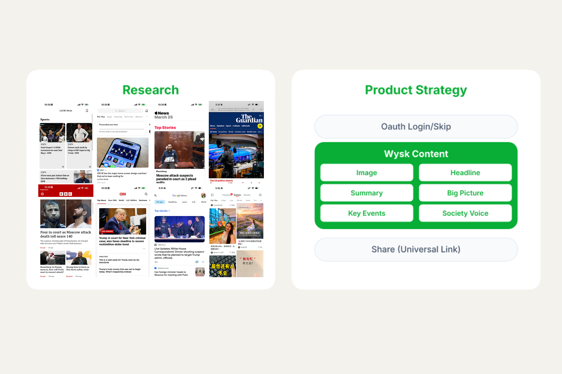
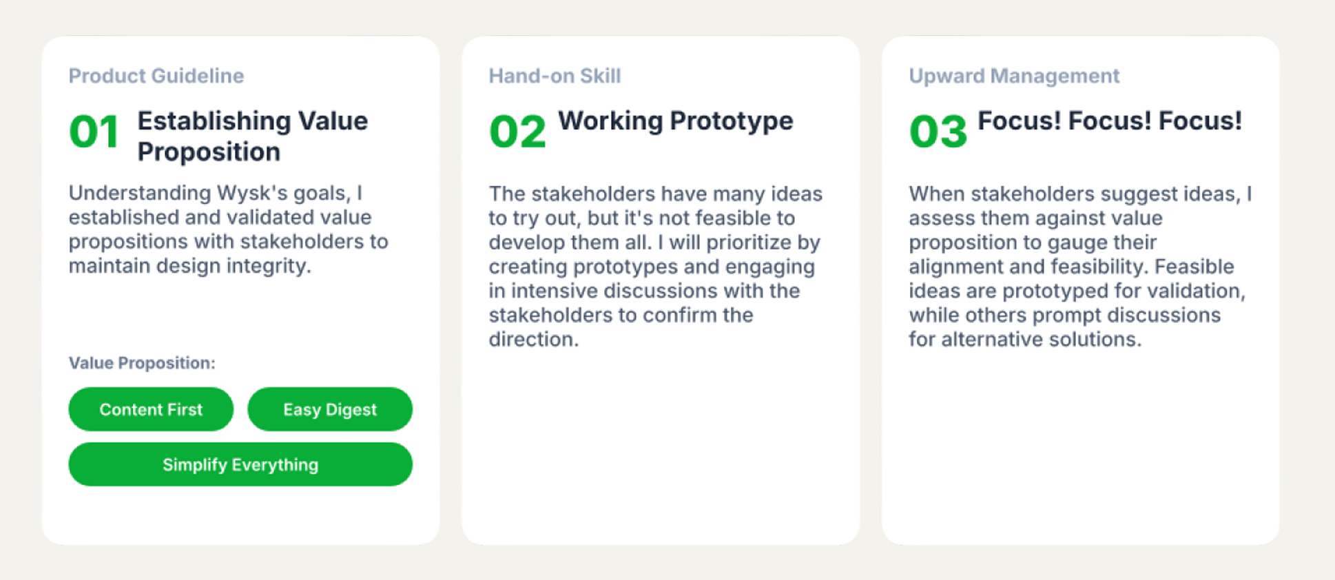
The CSO, CEO, and CTO each had strong, divergent intuitions about what Wysk should be. I established three value propositions early — Content First, Easy Digest, Simplify Everything — and used them as the decision filter for every feature debate. Where opinions diverged, I built working prototypes so we could argue against an artifact instead of an abstraction.
Three moves that kept us aligned:
- Set the filter first. Value propositions, agreed upon before spec, ended 80% of debates by reframing them as alignment checks.
- Prototype the disagreement. When stakeholders disagreed on interaction patterns (e.g., Key Events), I shipped two working prototypes — the conversation moved from opinion to evidence.
- Manage upward through the frame. I assessed every C-suite suggestion against the value propositions, not against authority. Misaligned ideas got rerouted, not rejected.
How do you make AI visible, not just present?
The AI had to be felt, not explained. A "powered by AI" tag means nothing if the experience feels like every other news app.
I made AI legible at three layers of the article:
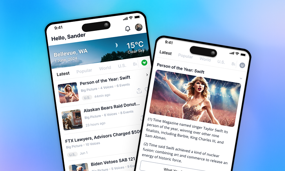
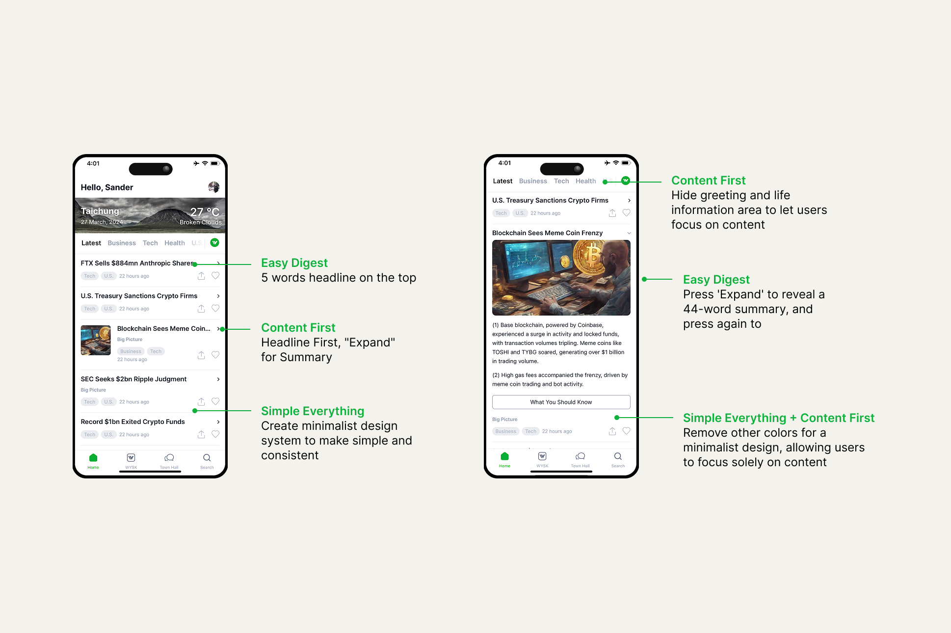
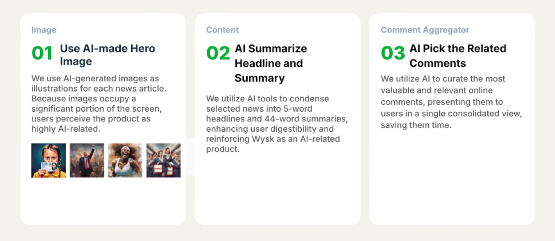
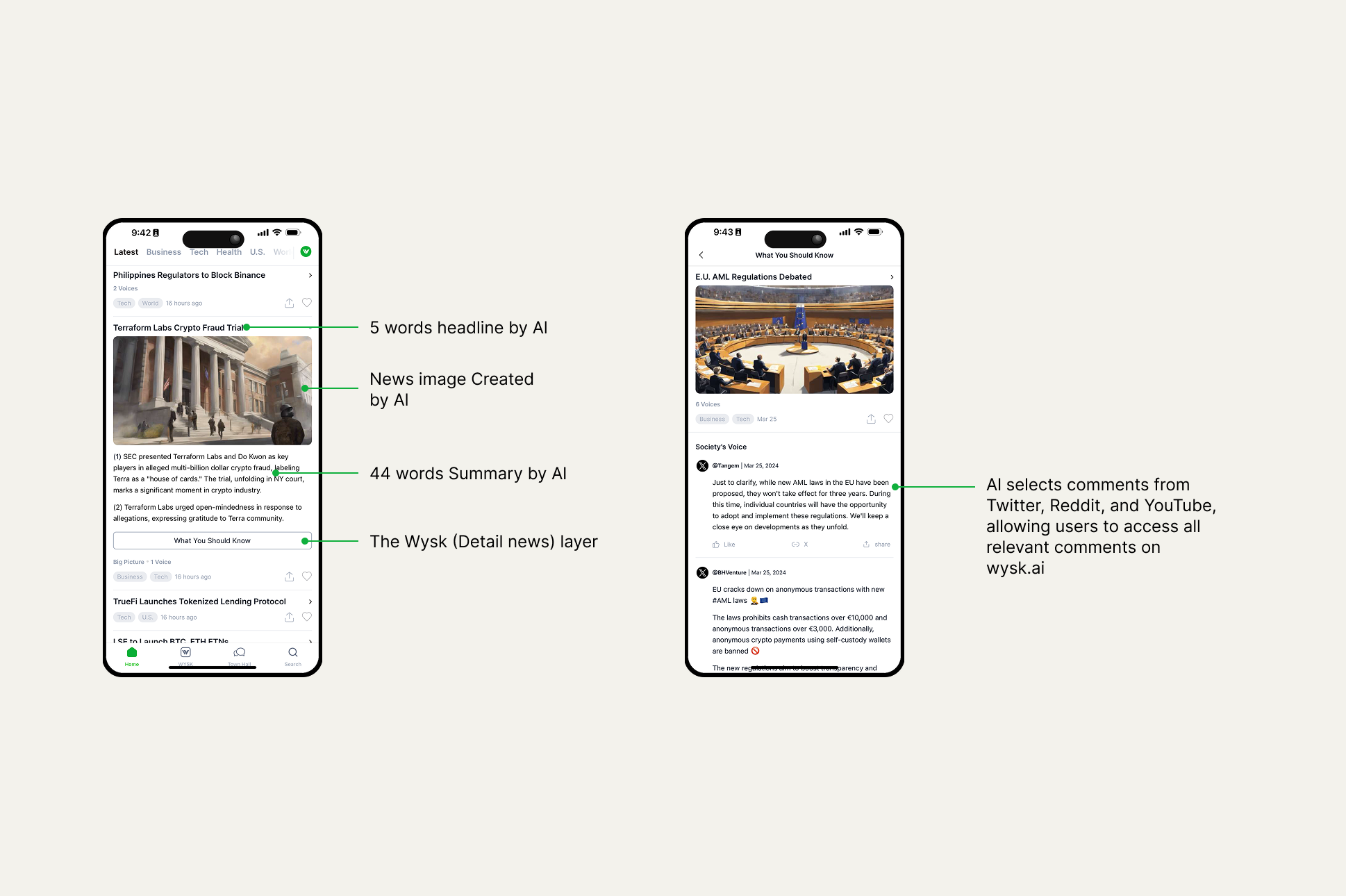
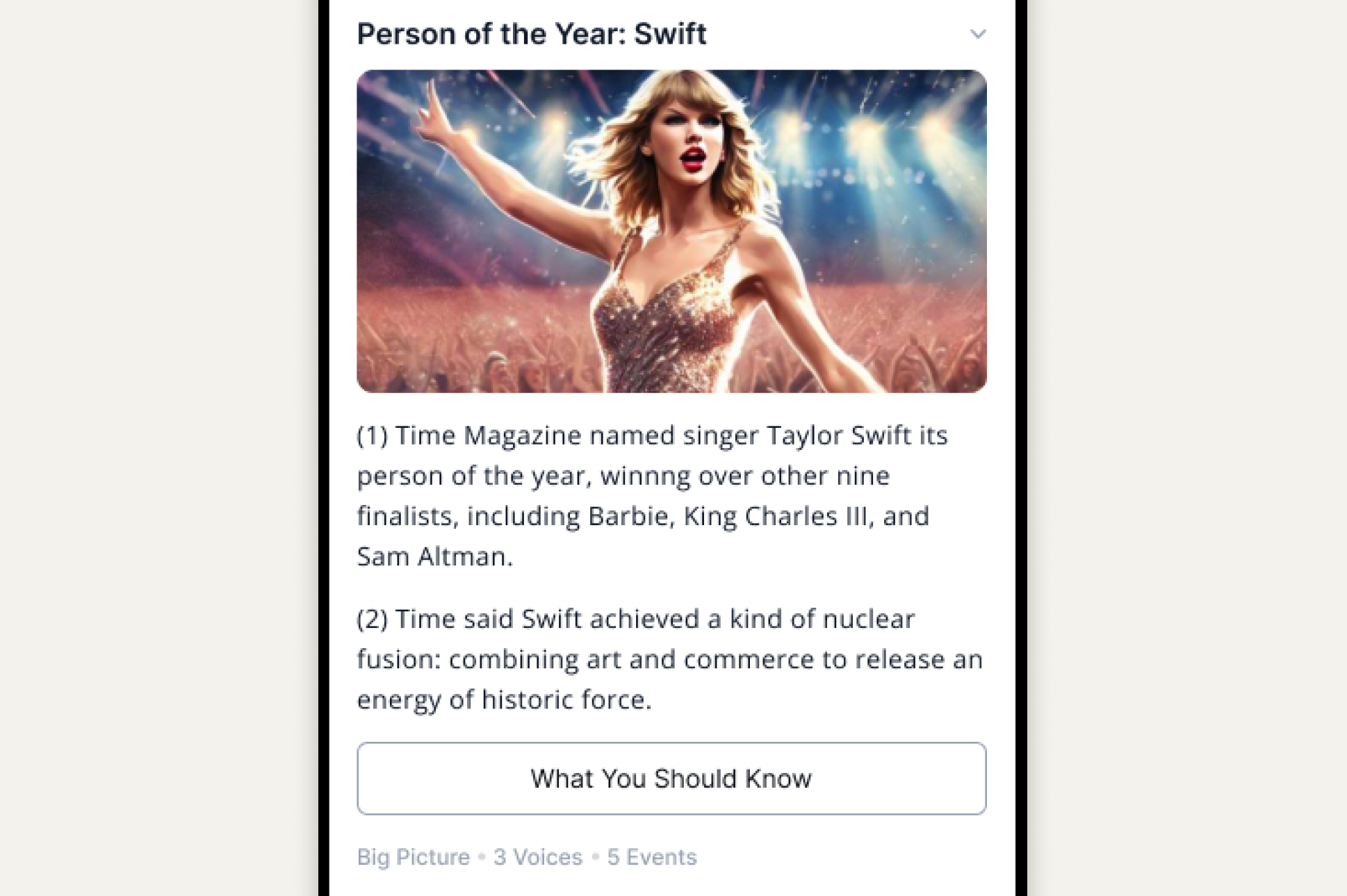
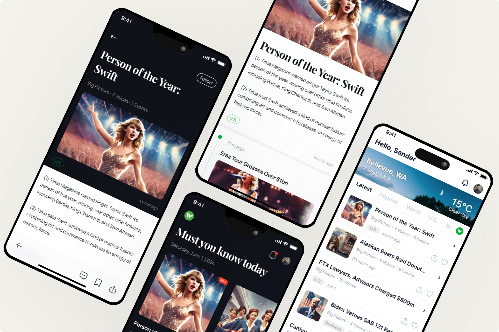
- Visual layer — AI-generated hero illustration on every article. Images occupy ~40% of screen real estate, so this single decision shifted the perceived AI density of the entire app.
- Content layer — AI-condensed 5-word headlines and 44-word summaries. The constraint itself signals "machine-processed" — humans don't write this way.
- Social layer — AI-aggregated comments from X, Reddit, and YouTube, deduped and curated per story. Replaces the noise of native comment sections.
How do you grow with zero marketing budget?
Two design decisions, one growth funnel: minimize friction at entry, maximize warmth before download.
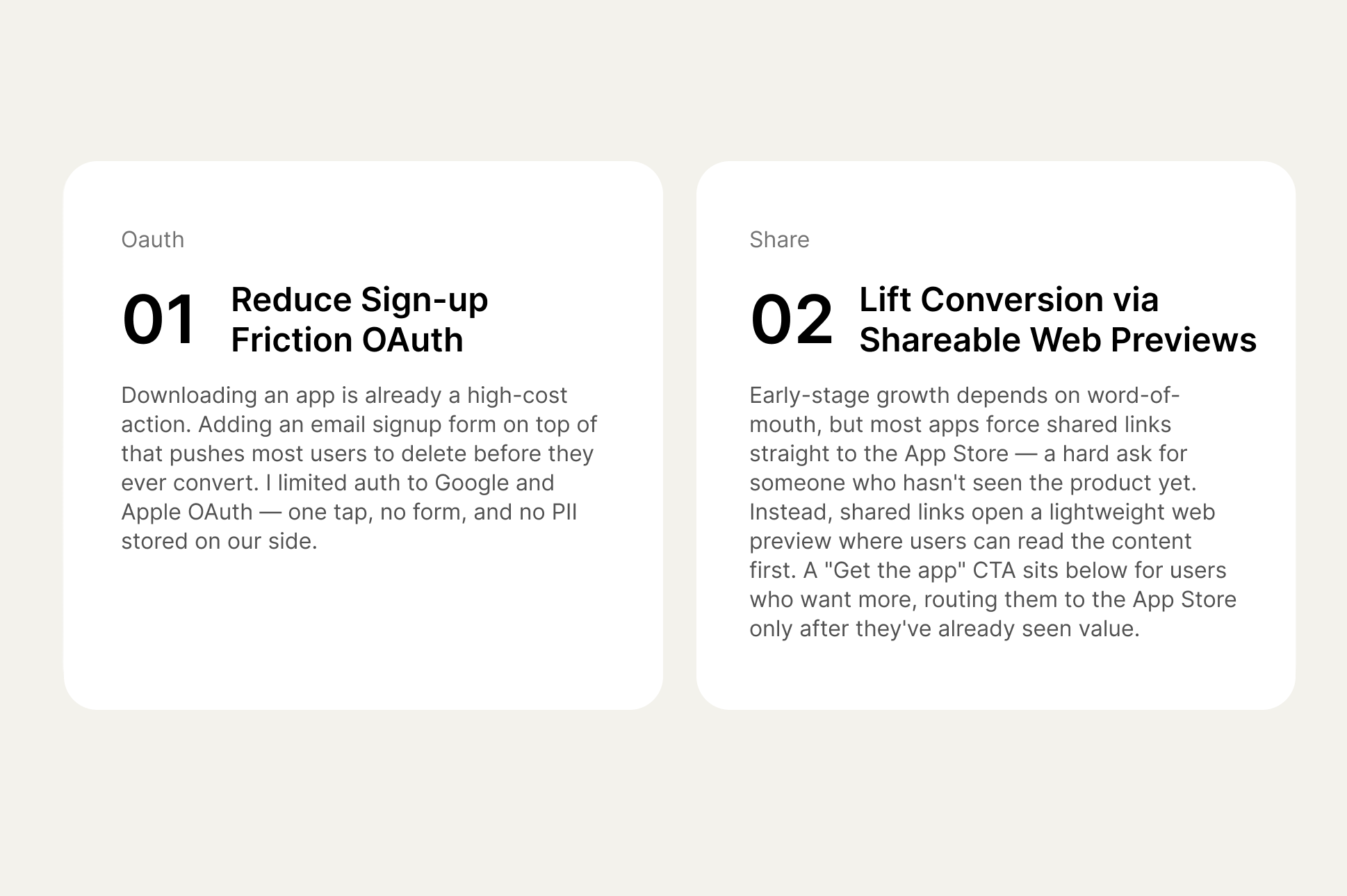
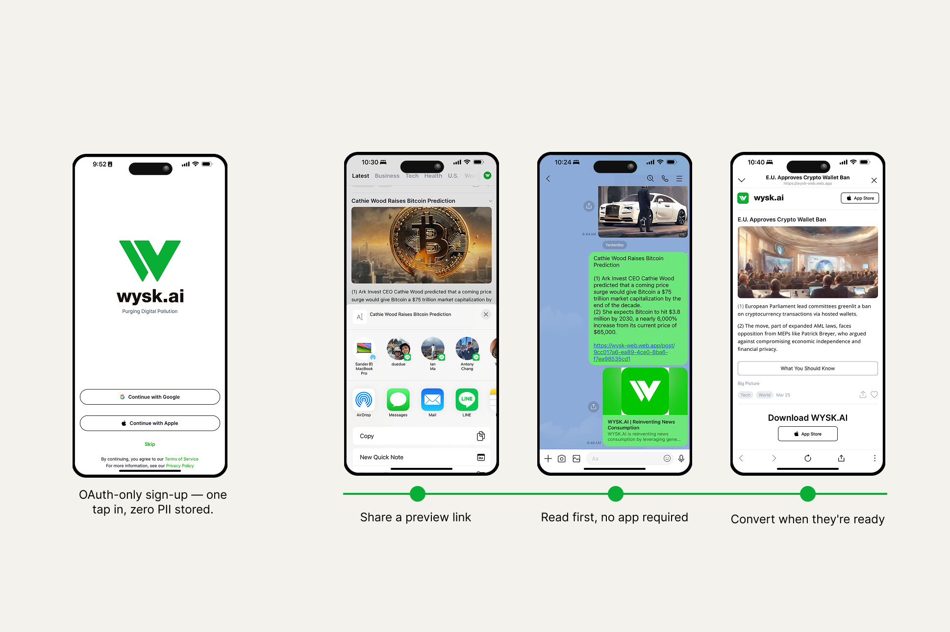
- OAuth-only sign-in (Google / Apple). No email forms, no PII stored. Removes the most common drop-off point in mobile onboarding — and removes our liability surface at the same time.
- Shareable web previews instead of App Store links. When users share an article, recipients land on a lightweight web reader, not the App Store. They read first, decide later. The "Download" CTA only appears once they've already seen the value — converting warm users instead of cold ones.
How the pieces compound
Each design decision was independently useful, but the real value came from how they stacked.
Low-friction sign-up gets users in. Web-preview sharing gets non-users in front of content. Together they create a funnel that grows itself.
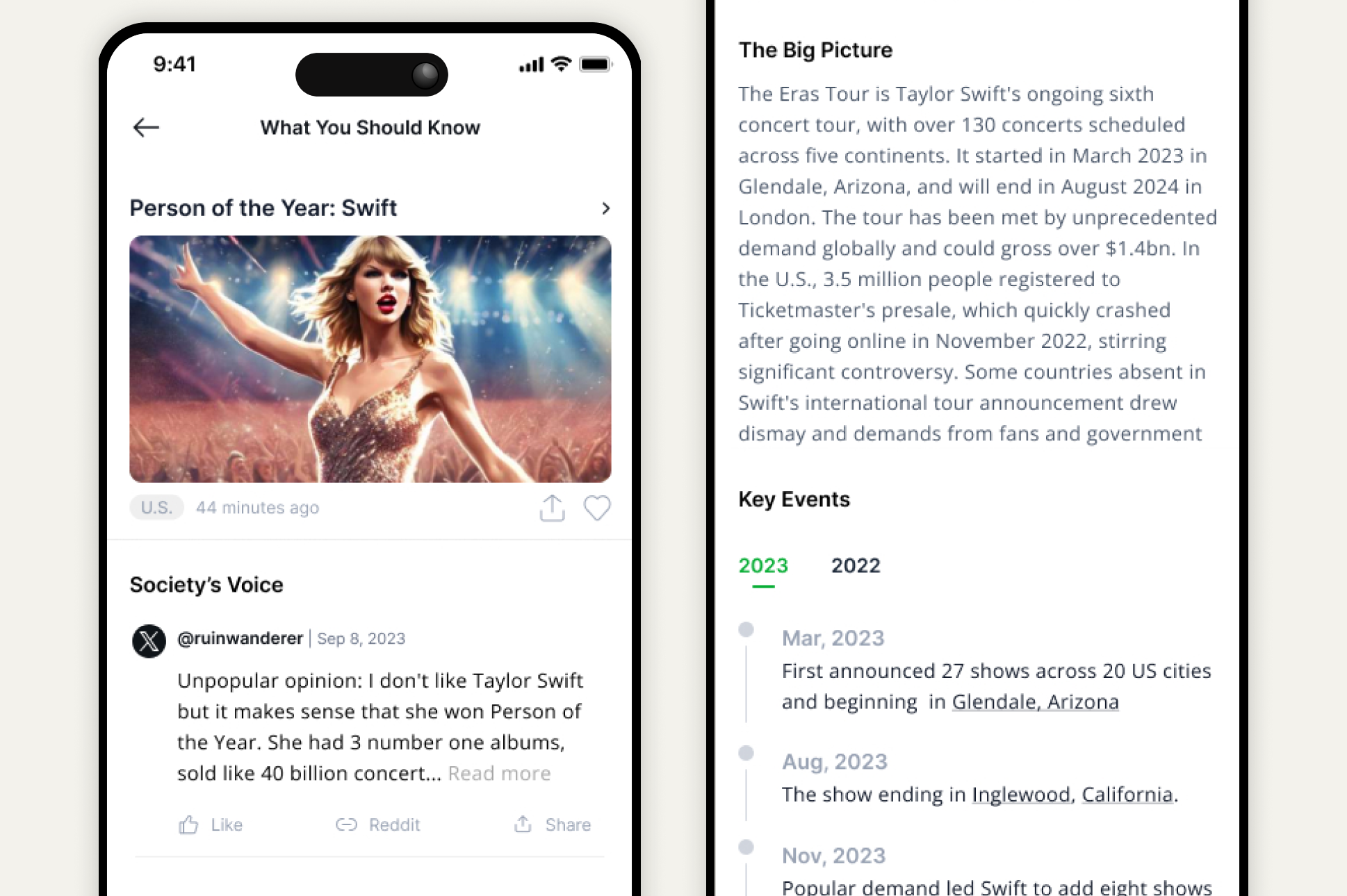
Hero image, 44-word summary, expandable Big Picture, curated voices, and a Key Events timeline, layered so users can stop at any depth.
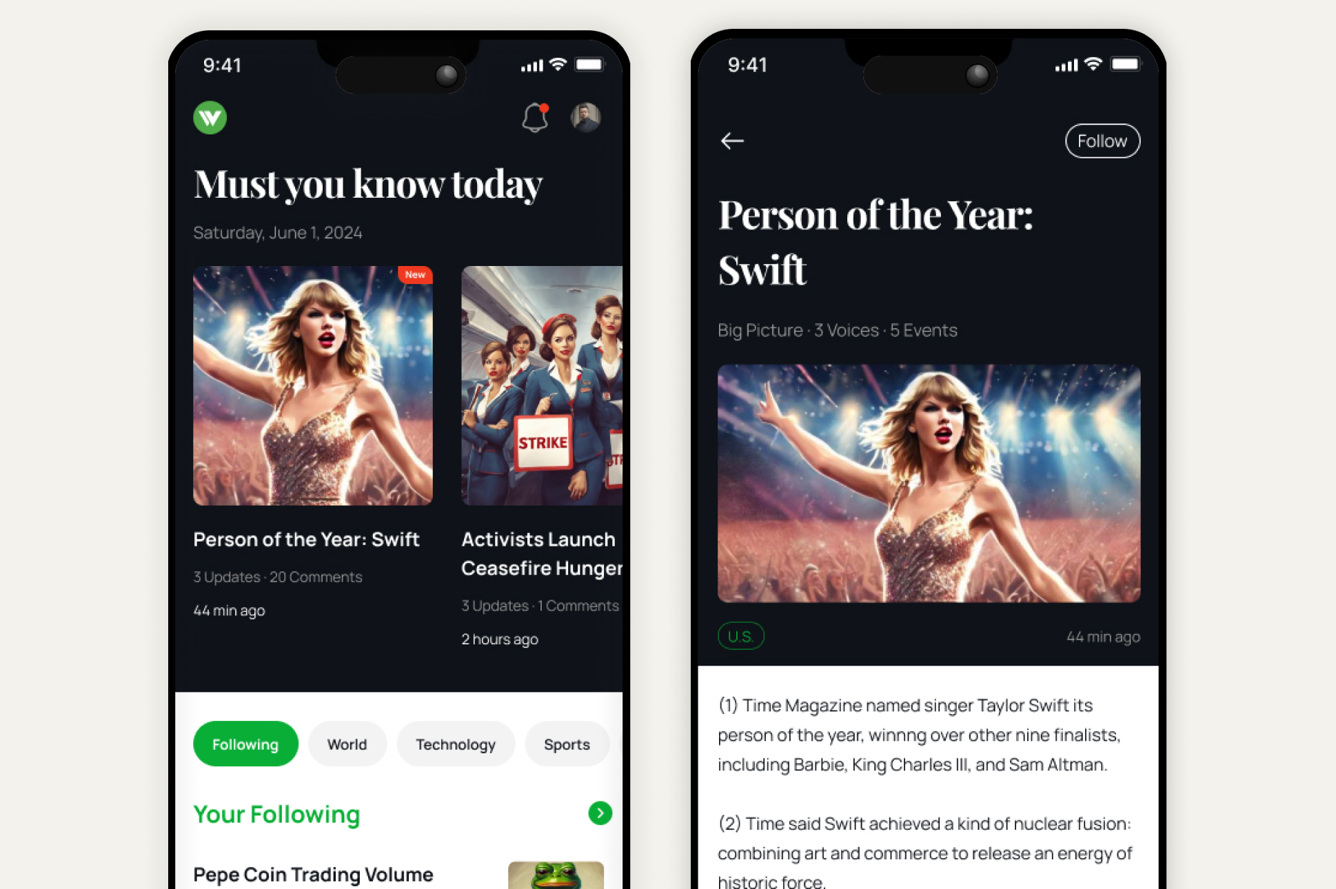
A "Following" feed surfaces topics the user has previously engaged with, turning one-time readers into daily returners.
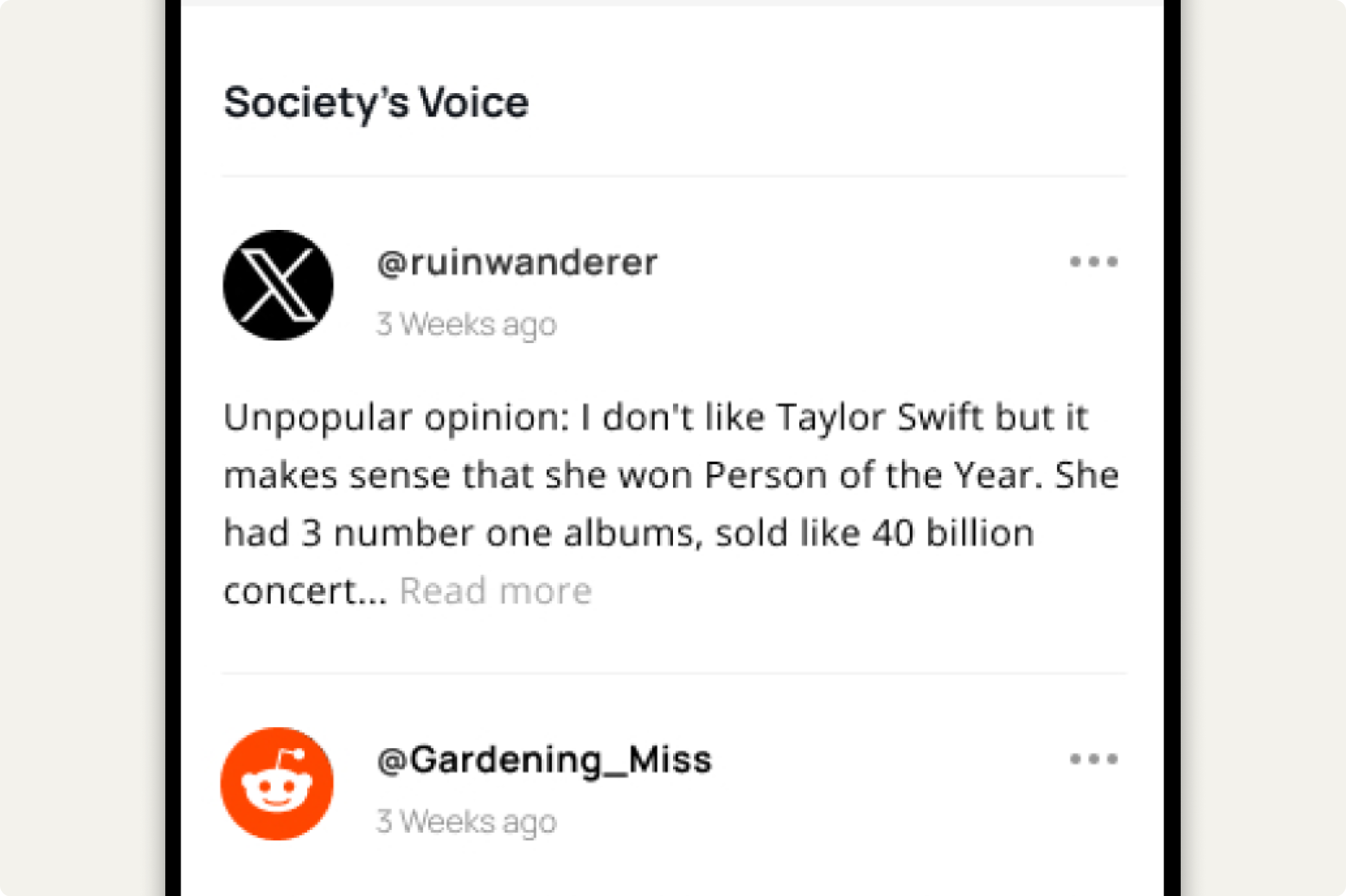
We pulled the most-engaged comments from X, Reddit, and YouTube, then ran them through our relevance algorithm so every voice shown connects to the user's reading history.
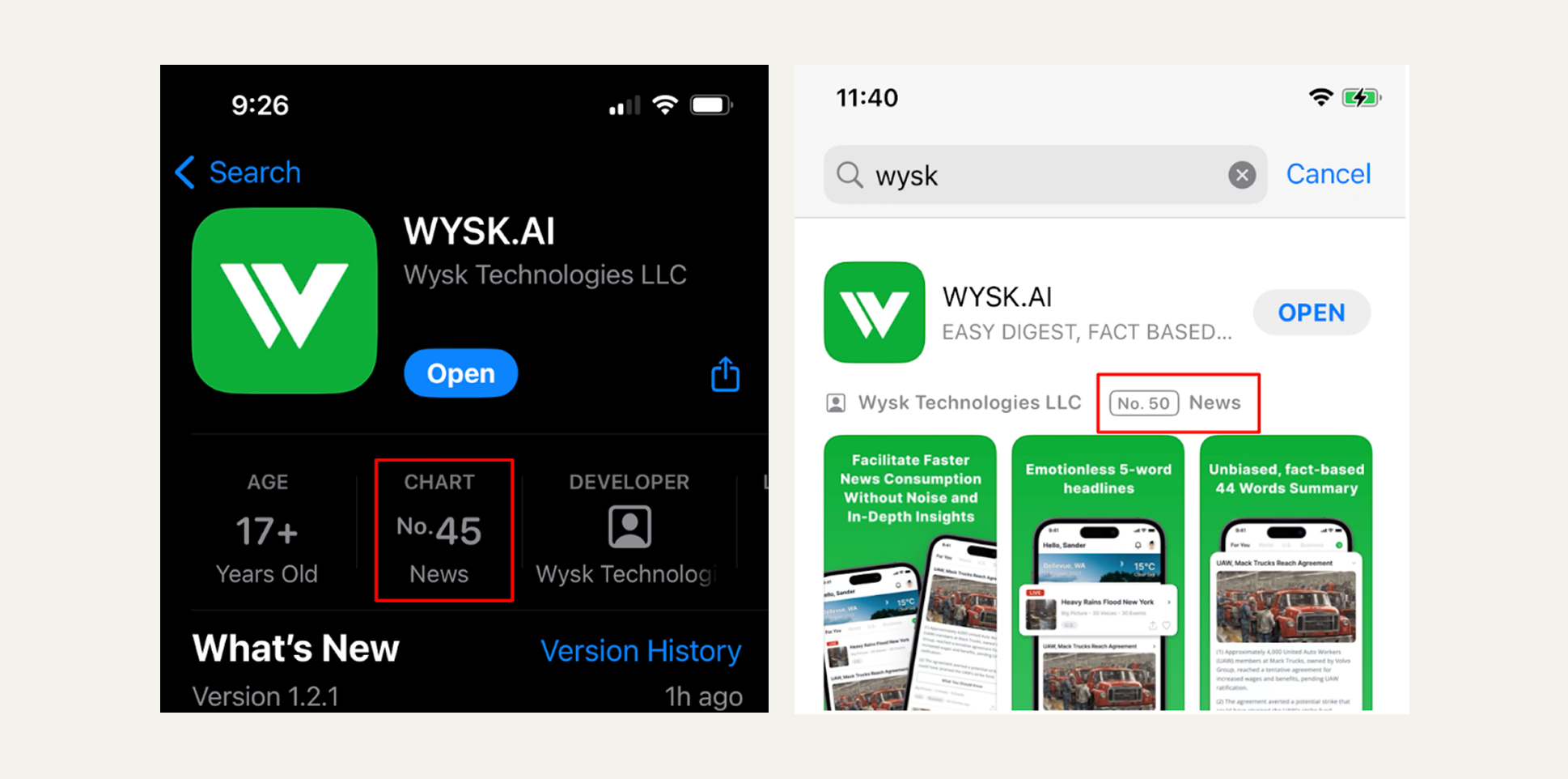
Shipped Oct 18, 2023. Zero marketing. Top 50.
#45 in Hong Kong, #50 in Taiwan App Store News charts — entirely from share-driven growth, no paid acquisition.
- Zero negative feedback across post-launch surveys in Taiwan, Hong Kong, and the US.
- On time, on budget — shipped exactly on schedule with a team of part-time developers.
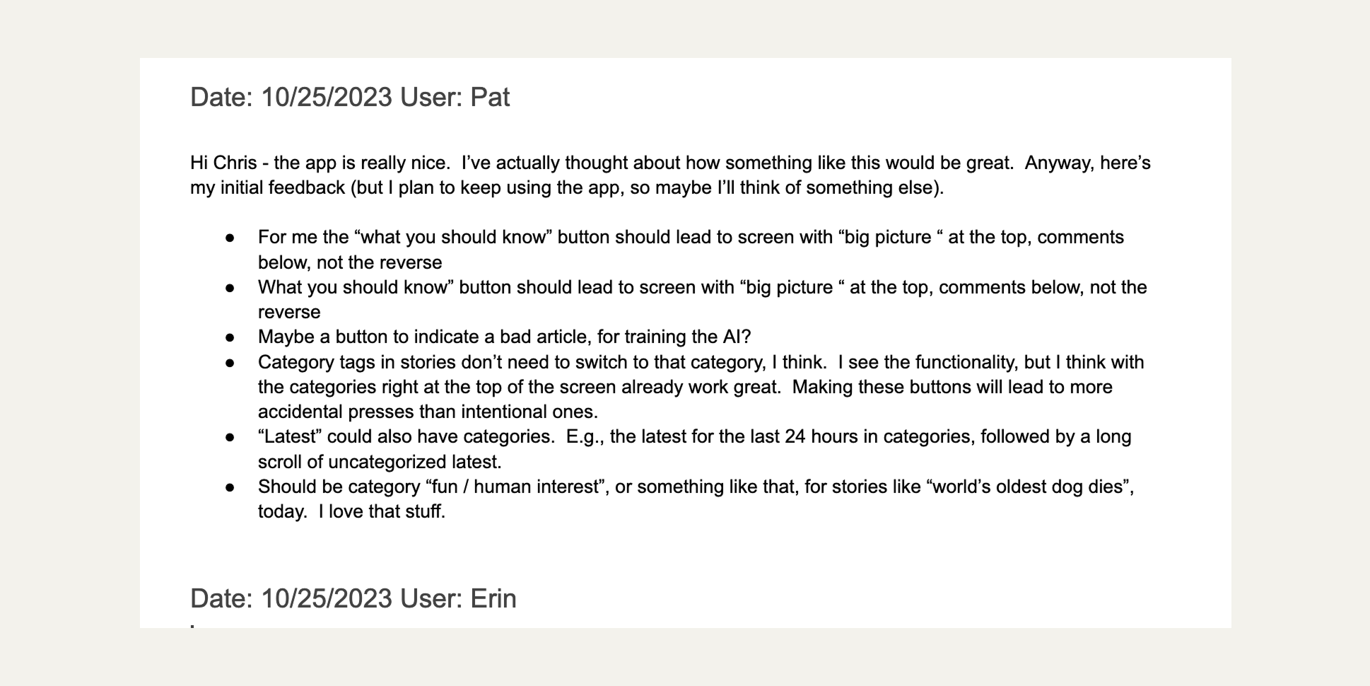
Unsolicited user feedback
"the app is really nice. I've actually thought about how something like this would be great…"